-
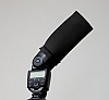 My choice of flash modifiers. Несколько прикольных самодельных приблуд для вспышки.
Using any of the myriad of flash modifiers that are on offer, helps in achieving that — spreading the light from the on-camera speedlight much wider, and thereby creating softer light that direct flash would’ve given. However, (and this is a big however), these flash modifiers also throw light forward. Ultimately all flash modifiers do the same thing — they disperse a lot of light around the room, while throwing some measure of light directly forward to lift shadows under the eyes and bring a sparkle to the eyes.
- Gehirn.ru. Неплохая подборка статей на русском языке о свадебной фотографии.
Вот не люблю я, когда, снимая кое-как, кто-то говорит: «А, ничего, потом в фотошопе (вариант — при печати) скадрирую как надо». Я люблю, когда с самого начала задумано хорошо и снято хорошо. Искусство фотографа во многом в том, чтобы отсекать лишнее из кадра, причем делать это, когда фотографируешь. А как этому научиться, если каждый раз, когда что-то не так, успокаивать себя возможностью пост-обработки.
-
 Nikon D300 Review by Scott Kelby. Скотт Килби обозрел новоприобретенный Nikon D300. Вроде доволен, хотя не без нареканий. Ну, а мой пока едет.
I’ve spent the past two weeks, many hours, had two meetings with Nikon Professional Services staff, and taken thousands of photos with my new Nikon D300 and I’m ready to spill the beans and let you know what’s hot (and what’s not) about Nikon’s new arrival.
-
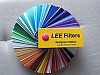 Flash Gels for Correcting Color Temperature. Статья в двух частях (вторая часть) об использовании гелевых вставок на вспышку для коррекции цветовой температуры.
A lot of people been asking me what are Color Temperature (CT) flash gels for and where they can find it.
- 85 Great Photography Blogs, Galleries and Sites You Can’t Afford to Miss. Еще один списочек «великолепных» сайтов о фотографии. Ничего нового, к сожалению.
I was happy to get familiar with 85 photography sites, blogs and galleries. During the course of the week, I have paid a visit to each of the sites and blogs, learning a bit about each of you. My RSS reader is now fully loaded with tons of new feeds.
-
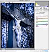 Creative Color Temperature and Raw Processing. Интересные эксперименты с балансом белого. Надо будет взять а заметку.
Color is the musical score of the image, and just as the musical score changes how you feel about a movie scene, the image’s color treatment will influence or, more fittingly said, will “tint” the viewer’s emotional response. The ability to experiment with image adjustment layers and creative color interpretations is a source of inspiration for me, and it is often surprising how the subtlest color adjustment can shift the emotional impact of an image.
- What makes a photographer’s website great? Несколько советов по облагораживанию вашего веб-портфолио.
In the current age of technology, a high-quality portfolio website is essential for a professional photographer because in many cases, your website is also your potential clients’ first impression of you and your work.
-
 Перспектива. Ну, собсно говоря, о ней, перспективе, и речь. Интересно было почитать. Спасибо автору.
Существует несколько видов перспективы, о которых помнят не все художники и дизайнеры, порой ограничиваясь рисунком в диметрии. А кто-то, возможно, знает о них, но пользоваться не умеет или не понимает необходимости. Думаю, многим будет полезно расширить свои знания понятием о перспективе и её видах.